This study is about the production and the description of some advanced visualization charts related to the higher education in South West Wales. Some actual data had been made available to complete this task and the objective is to get some meaningful and interesting insight about the data.
The data files are from a Management Information Officer in the Statistics Unit in conjunction with the Planning and Strategic Projects Unit (PSPU), both at Swansea University.
The tool used is IBM Many Eyes. It’s a web service that lets user upload data sets and can turn them into various visualizations. There were a lot of choices but only advanced visualization types (especially maps) had been highly recommended rather than basic charts. Further, graphs that show rises and falls over time had to be avoided as the provided data was not time oriented. So the five visualization types demonstrated here are block histograms, bubble charts, maps, matrix charts and tree maps.
1. Wales Map
Maps are really intuitive when it comes to show a comparison based on the location. In Many Eyes, the Wales map is slightly inaccurate but it allows us to get an interesting overview of the most popular regions where people go to study.
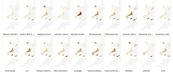
The following maps show the most frequented areas for each field of studies for the full time undergraduate students in Wales. The original data was dividing students according to their institutions. However, for the sake of mapping, those institutions had to be aggregated according to the respective cities they belong to. The darker an area is, the more it’s frequented for that field of study and inversely, the lighter a region is, the less it’s frequented. This doesn’t apply to the gray area, which represent the zone for which we don’t have any data.
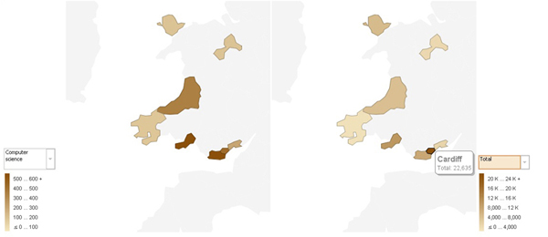
Now let’s consider a particular case, the field of computer science. We can clearly see that Swansea is one of the most popular destinations to study computer sciences in Wales. However, when we consider all the subjects together, Cardiff appears to be the most popular choice overall.
2. Matrix Charts
Matrix Charts are typically used to display multidimensional data in a grid. It’s very useful when we have many criteria to describe the same data, for example we use matrix charts to describe students based on the subjects they are studying, their institutions and whether they are undergraduates or postgraduates. Our grid down here offers a single row with 2 discs: UG and PG and within each disc, we can see the proportion of each subject relatively to others. The first result that strikes is that there are much more undergraduate students than postgraduate students.
Another obvious result is that there is a wide range of subjects studied in Wales.
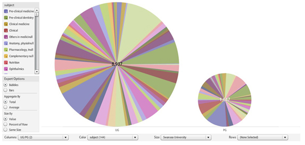
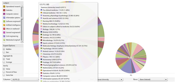
Below we see that Nursing (9.89%) and Psychology(5.6%) seem to be quite popular among undergraduates in Swansea university whereas Computer Science only represents 0.96%.
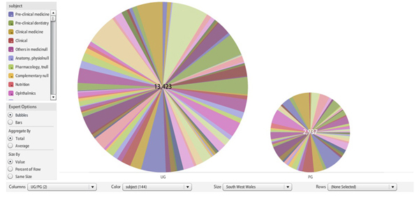
The matrix chart below represent almost the same data but only at the South West Wales level.
3. Treemaps
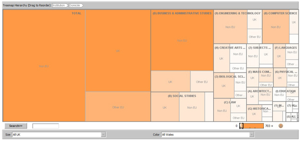
Treemapping is a method for displaying tree-structured data by using nested rectangles. Treemaps display hierarchical (tree-structured) data as a set of nested rectangles. Each branch of the tree is given a rectangle, which is then tiled with smaller rectangles representing sub-branches (Wikipedia definition). For our purposes, we use treemaps to visually compare the differences in number of students among areas of studies at the full time postgraduate taught level. We subdivide the students in the fields of studies according to their origin (UK, EU, Non-EU). The diagram obtained gives us some interesting insight.
For example, we notice that a lot of non- Europeans comes to the UK for business and administrative studies. Further, for most of the subjects, the number of non – Europeans exceeds the number of other EU students.
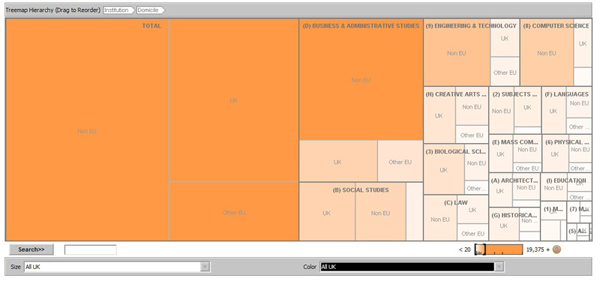
What we observed at the UK level is quite similar to what we see when we consider the Wales only. However the colours tend to imply that the percentage of international students is less in Wales.
4. Bubble Charts
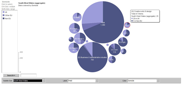
Bubble Charts are another intuitive and atheistically pleasing to visualize “who is studying what”. Here again we are studying the full time master students.
The figure below confirms the wide proportion of Non EU students in South West Wales. And here again we see they are highly represented in Business and Administrative studies. Anyways, Business and Administrative studies apparently represent the most popular field of study.
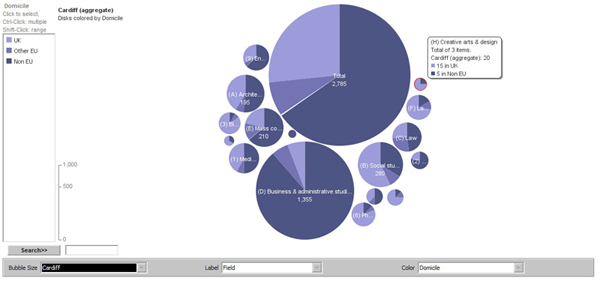
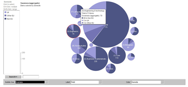
The two following Bubble Charts display the cases of Cardiff and Swansea. The trend is quite the same with the rest of the South West Wales but we can notice that compared to Cardiff, Swansea presents a smaller proportion of Business and Administrative Studies students. However, in Swansea, Engineering and Computer Science are quite more popular than in Cardiff.
5. Block Histograms
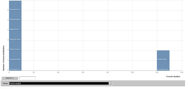
A block histogram lets you see the distribution of numeric values in a data set. The x-axis is divided into "bins" that correspond to value ranges. Each item in the data set is drawn as a rectangular block, and the blocks are piled into the bins to show how many values in each range. (Many Eyes definition)
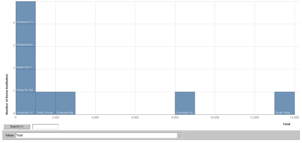
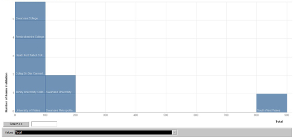
The figure down here shows the populations of full time undergraduate students based on their institutions. It clearly comes out that Swansea University is by far the favourite destination for studying French with more than 120 students. All the other institutions only have less than 10 students for the French Language.
We then observe a comparison between full time UG and part time UG students (again based on their institutions). The first thing that comes out of those visualizations is that there are much more full time students than part time students (which makes sense). Further, while Swansea University seems to be quite popular among full time students, the population of part time students is pretty much equally spread among the institutions.
