This is a comparative study of two particular types of visualization techniques in detail.
We chose to study the map-based visualization and the bubble charts because they had been the most fascinating visualizations throughout this study. We are going to compare those two types on many factors.
Defining the visualizations
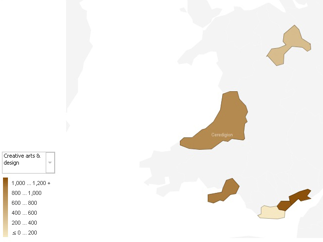
A thematic map is a type of map or chart especially designed to show a particular theme connected with a specific geographic area. These maps can portray physical, social, political, cultural, economic, sociological, agricultural, or any other aspects of a city, state, region, nation or continent.
An example of map is shown below. It shows the repartition of undergraduate students studying creative arts and design in Wales.
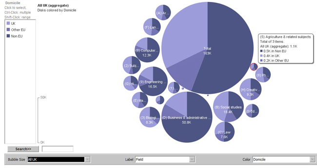
A bubble chart is a type of chart where each plotted entity is defined in terms of three distinct numeric parameters. Bubble charts can facilitate the understanding of the social, economical, medical, and other scientific relationships.
An example of bubble chart is shown below. It shows the repartition of master students, in the whole UK, according to their fields of study and origins.
Expression of the information
Both visualizations can convey the information pretty well to the viewer but the map based visualization is limited to spatial patterns. As mentioned above, it can be used to describe data related to places (cities, states, regions, nations or continents). On the other side, bubble charts can convey information of any nature. Further, they can convey many different kind of information at a time.
Discovery of deviation, hierarchy, relationship and association
The maps show well the relationships between places and the association among regions. They are also good for comparing 2 places based on a specific criterion.
The bubble charts are good for comparison too since they allow to show many different things at a time. Further, the circles can contain inside them some more data. This nesting can help understanding hierarchy when it occurs.
Depiction of data at different scales
Bubble charts are especially useful for data sets with dozens to hundreds of values, or with values that differ by several orders of magnitude. They can legibly show data values that differ by a ratio of 100,000, and can display hundreds of individual values at once (according to many eyes).
However the maps are not always efficient to display huge and/or complex data. The problem is that some regions on the map can be very small and they just don’t fit to add some complexity or some advanced charts. It’s true that we can zoom, but if regions are too far apart from others, zooming somewhere make us miss another important part of the data. We can then say that maps don’t really provide much level of details.
Ease of use and understanding
Maps are really intuitive, easy to learn, to use and to understand, even to lay persons. Actually we had been using maps for ages, at primary school during the geography lectures for example.
Bubbles charts on the other hand are quite unusual to lay persons. Further, they can be quite confusing and difficult to understand when they contain a lot of data.
Look and feel
Both the visualizations are atheistically pleasing to visualize, especially when we use colours to demonstrate the differences between two categories. We can also use bubbles on maps, and the sizes of the bubbles make obvious which part of the map is the bigger, greater, etc.
Conclusion
Thematic maps are great tools that communicate the information well to everyone. However they only apply in a context of space. Further, they hardly deal with complex data.
On the other hand, bubble charts are a bit more difficult to handle but they are really powerful, they can handle any kind of data whatever the scales.
And also some data may not be displayed properly if not spelled as in the map.
So maps are good to represent simple and spatial data whereas bubble charts are better for representing the most compound data.